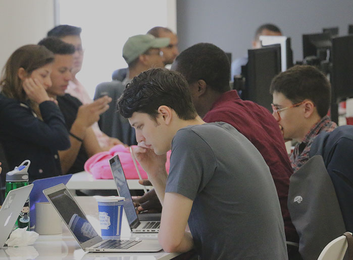
At Flatiron School, we believe that people learn better when they learn together. On the product team, we’ve been hard at work making sure that our online students are able to benefit from collaborative learning the way the students in our in-person immersive classes do. Over the past quarter we’ve introduced Learn chat lobbies and a Friends feature and there are many more exciting features to come.
With that in mind, we decided it was time to give our student profile pages some love. What’s the point of all these great tools for collaborating if we don’t make it possible to know who you’re collaborating with?
One of These Things Is Not Like the Others
In early 2016, we redesigned our site and switched to an object-oriented approach to CSS. All new features were built using our in-house CSS framework and many of the original parts of the app were switched over. As the year came to a close, our profile pages were still rocking their retro design and spaghetti css.
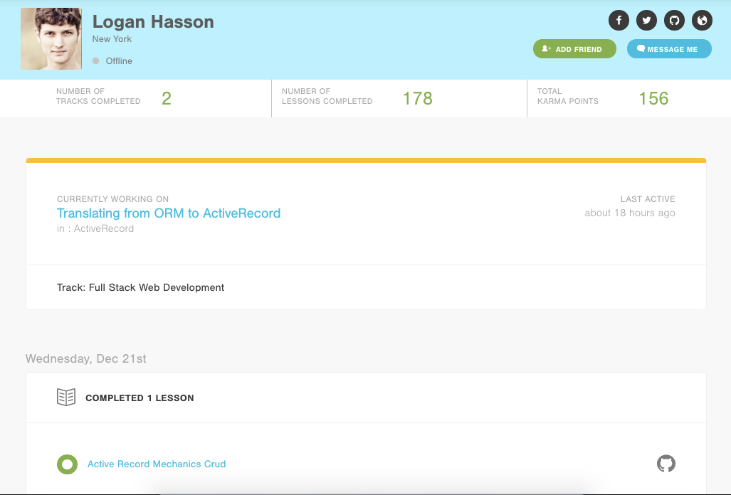
Our profile work started with the design team creating a beautiful, clean design that makes it easier to see what your fellow students are working on (perfect for finding pairing partners!). The design also fit with the aesthetic of the rest of the site which allowed us to build the page with existing CSS components. A new, beautiful page with far less CSS? That’s a win – win!
Beauty is Only Skin Deep
One important aspect of our redesign was making sure that the profile pages would be more useful to our students. To achieve that, we’ve added a couple features and made some existing features more prominent.
When you’re on another student’s page, you’ll clearly be able to see their social buttons in the upper right corner. This includes links to any outside sites that they’ve provided (like twitter or their personal blog) as well as a button to add the person as a friend (as described in the Friend Feature launch).
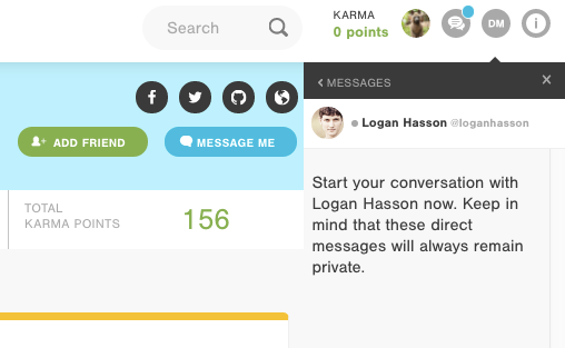
If you click on the “Message Me” button, you’ll now be able to send someone a direct message while you’re viewing their profile page. You can use the new timeline to see what they’re working on. Then, take the opportunity to give them some words of encouragement or propose pairing on a project.
If you’re viewing your own profile page, you’ll see that the “Edit Profile” button is now much more prominent. It’s always been on the page, but, it was a bit hidden. Now that these profile pages are going to become a social hub, we want to make sure you know exactly where to go to customize your information.
Although we’ve added some fun features, for people familiar with the old profile pages, the new design may feel more stripped down today. Don’t worry. It’s part of a longer-term goal of continuing to make this page more useful. In the coming months, expect to see more come alive on the page!
Make It Work. Make It Right. Make It Fast.
There’s no denying that the old profile pages were a bit slow to load. I’m not saying that we started loading a profile page, then went to lunch while it loaded…but, I’m also not saying that we didn’t. The page didn’t start out slow, but, as the Learn app grew, the amount of data being handled by the profile page also grew.
To speed things up, we revisited some existing database queries that had initially been sufficient because we didn’t have a lot of data in our database. Over time though, the increasing volume of records drastically slowed down the load time of the profile page. With some thoughtful tweaks to our queries, our profile pages had the data they needed in much less time.
class TimelineEvent extends React.Component {
  render() {
    return (
      <li className="status-alert" data-status="good">
        <div className='media-block media-block--dual-media'>
          <div className='media-block__media'>
            <div className='status-alert__bubble'></div>
          </div>
          <div className='media-block__content'>
            <a href={lessonsPath(this.props.lesson_id)}>
              {this.props.content_title}
            </a>
          </div>
          <div className='media-block__media'>
            <a href={this.props.relevant_github_url} target="_blank">
              <svg className='inline-svg inline-svg--fixed-size-large inline-svg--fill-grey'>
                <use xlinkHref='/assets/sprite.svg#svg__logo--github'></use>
              </svg>
            </a>
          </div>
        </div>
      </li>
    )
  }
}
We also used a javascript library called React to move the majority of the responsibility for loading and displaying the data to the client. This allows the page to load quickly while the timeline finishes rendering asynchronously. Additionally, because React creates a virtual DOM and only redraws elements that have changed, if you click to see more timeline events, the new events display more snappily.
The redesign and code overhaul has put us in a great position to add additional features to the profile pages without slowing them down again. We hope you’re as excited as we are for the fun enhancements that are coming in 2017. As the features roll out over the upcoming months, we welcome any feedback and comments. Just shoot us an email at support@learn.co.
Want to experience this feature for yourself? Try it out in our new free Bootcamp Prep course today as you learn to code and prepare to get into today’s top coding bootcamps.
Written byJESSICA RUDDER
Developer, Flatiron School


