Welcome to our Flatiron Engineering blog series. In this series, the engineering team behind Flatiron’s learning platform pull back the curtain and share insights into how we build our products.
A few days ago, I walked you through the first steps Flatiron School’s engineering team went through to overhaul the CSS in our Learn.co codebase. We covered how to take a visual inventory of a site and translate repeating patterns into CSS. Today, we’ll take a look at the next few steps in the process. Be sure to read Part 1 of this post before reading this.
[irp posts=”2759″ name=”How Object-Oriented Design Saved Our CSS (and Site Performance) – Part 1″]STEP 3: REWRITE
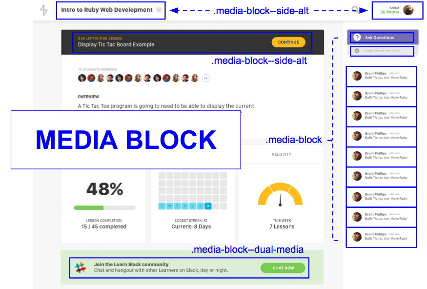
We’ve designed our system. Now it’s time to rewrite all of our markup. We’ll look at one of the most commonly-used patterns as an example: .media-block.

.media-block has three main parts: the parent .media-block class and two child classes: .media-block__content and .media-block__media.

When writing the markup, start by outlining the basic container and objects. Rely on the semantic BEM syntax to provide information the the relationships between elements – parent <> child, nesting level, etc.
<div class="media-block">

  <div class="media-block__media">

    <!-- circle with user’s profile picture -->

  </div>

  <div class="media-block__content">

    <!-- text object: user name -->
    <!-- text object: time ago -->
    <!-- text object: action completed by user -->

  </div>

</div>
After you’ve built the frame, add text and media elements to fill out the card. Your end product is a fully encapsulated, reusable block of markup that’s ready to drop into any view.
<div class="media-block">

  <div class="media-block__media">
    <div class="image-frame image-frame--border-radius-full">
      <img class="image-frame__image" src="img.png"/>
    </div>
  </div>

  <div class="media-block__content">
    <span class="heading heading--level-5">Brent...</span>
    <span class="heading heading--level-6">5 min ago</span>
    <h5 class="heading heading--level-5">Built...</h5>
  </div>

</div>

::record scratch::
But what about our JAVASCRIPT?
This project required us to rewrite all of our CSS and markup, which means we had to rewrite our Javascript selectors, too. We relied on semantic BEM syntax here as well, adopting the following syntax for any Javascript selector element: descriptor prefixed with .js--. For example, .js--toggle.
This was also a good opportunity to decouple our JS and CSS. Moving forward, .js-- classes have no styles attached to them. They’re reserved for JS selectors only.
STEP 4: ONBOARD THE TEAM
We onboarded our team in three phases.
In phase 1, we shipped new stylesheets and markup as dark code, “hidden” behind a feature flag. I also held a brief training session with the team on BEM syntax and OOCSS basics.
In phase 2, we QA’d the feature while gradually turning the feature flag on for a greater and greater percentage of our users. I held a second training session with the team where we did some hands-on practice rewriting existing markup.
In phase 3, we flipped the feature live for 100% of our users. I shipped a style guide with full framework documentation, and then paired with teammates as needed on new feature builds, until the whole team was comfortable with the new system.
In all, the process took about two and half months, with three dedicated devs at peak, eventually scaling back down to one.
CHALLENGES
This project wasn’t without its challenges.
The primary beast we faced was scope creep. Originally, this project was prototyped for three user-facing views. It grew to cover ALL user-facing views. And since we had to rewrite our JS selectors anyway, we ended up refactoring most of our Javascript alongside our markup and CSS. Letting things expand like this easily added another few weeks to the project.
After scope creep, the second biggest challenge we faced was something I’ll call neophobia – fear of change. Change is scary, and some people on our team were very comfortable doing things the old way (maybe too comfortable). Some folks were also pretty wary of CSS in general, and those deep-seeded biases were hard to overcome. But I’m happy to say once everyone started actually using the system, they were completely won over.
Finally, we had to and continue to be vigilant against “outliers”. Whenever designs introduce one-off elements, or something otherwise inconsistent with our existing UI, it’s our responsibility as engineers to push back before adding any new CSS. Product/design now needs to justify the introduction of stylistic inconsistencies.
RESULTS
So what did all this work earn us?
First, we saw impressive UX gains. Paring down our code gave us faster pageloads, a more consistent UI, and greater parity with our product mocks.
We also enjoyed some nice developer gains. This plug-and-play system allows our team to ship faster. Now we can build new views without writing any new CSS. We can reuse markup with predictable results, so prototyping becomes faster and better reflects the final product, and devs don’t need much front-end experience to be able to put up a nice looking view quickly.
Maybe most impressive our all were our performance gains. Below are unzipped, unminified size comparisons for our before-and-after assets payload. You’ll see we were able to reduce our payload by 10X.

Here’s average page render times for our most heavily trafficked views. We cut most of these in half.

We devoted a lot of resources to this project, but as you can see from these big wins, it was well worth it. The biggest lesson learned was not to wait. You can save yourself a lot of pain by applying OO design to your CSS from the start.
ADDITIONAL RESOURCES:
Nicole Sullivan’s OOCSS
- https://github.com/stubbornella/oocss/wiki
- http://confreaks.tv/presenters/nicole-sullivan
SMACSS Style Guide
- https://smacss.com/
BEM Syntax
- https://css-tricks.com/bem-101/
- https://en.bem.info/method/key-concepts/
This post initially appeared on Kate’s blog on February 20, 2017.
Written byKATE TRAVERS
Developer, Flatiron School