Welcome to our Flatiron Engineering blog series. In this series, the engineering team behind Flatiron’s learning platform will pull back the curtain and share insights into how we build our products.
Back in January 2016, our CSS was easily the messiest part of the Learn.co codebase… something that probably sounds familiar to many other web developers out there. Last spring, we budgeted time and resources to overhaul it. I led that project. Here’s what we learned.
Before diving in, let’s clarify what we’re talking about when we talk about object-oriented design. Object-oriented code is:
- Modular: reusable
- Encapsulated: self-contained with minimal dependencies
- Maintainable: easy to work with, which is especially important for smaller dev teams like ours
Learn.co is built on a Rails backend, and Rails strongly encourages writing code in an object-oriented paradigm. But how does that apply to stylesheets? As good Rubyists, we tried to follow object orientation with our CSS, but we were doing it wrong. To illustrate, let’s take a look at our old stylesheets directory tree.

Very similar to the Rails boilerplate setup, we had one stylesheet per view, with styles namespaced under a top level ID. This approach is fine when you’re starting out, but over time, it can get out of hand. Just look at where ours was pre-rewrite:

As you might be able to guess from this monster bundle, this approach is NOT object oriented.
It’s not modular. Styles are page-specific, so opportunities for code sharing are missed, and you end up with lots of code duplication. Plus, if you redefine styles on a page-by-page basis, you inevitably end up with inconsistencies in implementation and the visual interface itself.
It’s not encapsulated. Nesting everything under a top-level ID kicks things off with a high level of specificity that you’ll be battling throughout the rest of your stylesheets. This setup also makes it hard to predict what’ll happen when you change a class name or reorganize the sheet.
It’s not maintainable. Maintaining this kind of CSS is PAINFUL. Writing new CSS for every new view slows down development. It slows down page performance, too, contributing to a massive assets payload. Lots of new CSS means lots of churn, again increasing the risk of inconsistencies in code and design. And good luck trying to onboard into that mess.
We knew our CSS was broken. But what’s the solution?
Enter OOCSS.

After consulting with our good pals at Cantilever.co, we committed to an OOCSS solution. But now we had another decision to make: use an existing OOCSS framework or roll our own?
There are lots of off-the-shelf frameworks out there, including Twitter Bootstrap, Yahoo Pure, and Zurb Foundation (some of the most popular options). We considered three main factors.
Performance. Most off-the-shelf OOCSS frameworks are one-size-fits-all, aka HEAVY. We thought it’d be more efficient to roll our own framework, because we could limit it to the leanest, cleanest version possible.
Adaptability. Pre-rewrite, we relied on a good amount of vendor styles. Any time we needed to customize something, we’d create an “override” sheet, adding more payload and more specificity conflicts. So we loved the idea of sticking to easily-adaptable, in-house styles only.
Speed of development. With third party libraries, you have to wait for the maintainers to make updates and fix bugs, and their schedules don’t always align with yours. We ship fast, so being able to manage dependencies and handle updates internally was super appealing.

We had a big task in front of us: writing our own Learn.co-customized OOCSS framework. We broke the process out into a four step roadmap:
- Take visual inventory of app’s UI/UX
- Build component OOCSS library
- Rewrite CSS and markup
- Onboard the rest of the team
STEP 1: VISUAL INVENTORY
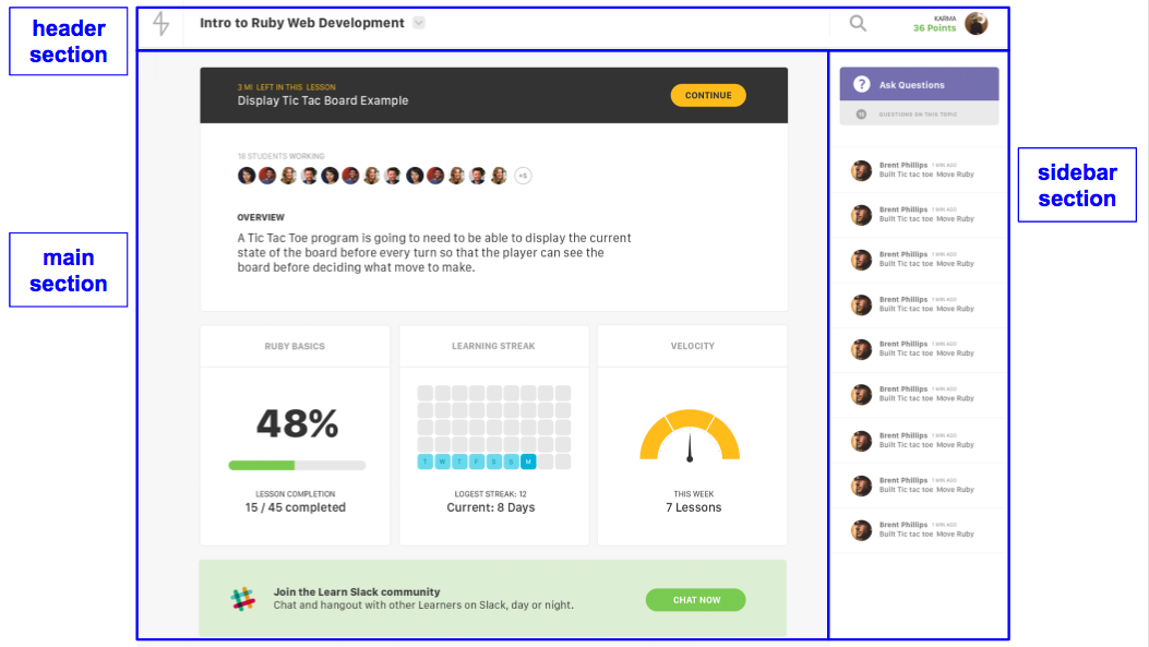
The first thing you’ll want to do is take a visual inventory of your entire site. The goal is to break down the design into recognizable patterns. We can use the Learn.co landing page as an example.

Start with the base layout – your header, footer, sidebar, etc.

Then take one step inward and look for “containers”.

Look inside those containers for recurring “objects”.

STEP 2: COMPONENT LIBRARY
After you’ve identified repeating patterns, the next step is to translate them into CSS. Working with Cantilever.co, we designed a system that groups stylesheets into four main scopes:
Layout components set the baseline styles for the page grid, headers, footers, overlays, etc. Since these classes require the most precision and are the least likely to change, they tend to contain more rigid, powerful rules than the rest of your components.
Container components are the real workhorse of your OOCSS system. They’re built to contain other elements, like lists or images, and they’re in charge of handling spacing, background, borders, and alignment.

Object components handle styles for the smallest, discrete elements at the very bottom of the DOM tree, like buttons, links and images. They’re always the containee, not the container, and they should have the same, predictable behavior no matter what container they’re placed inside.

Global components are your cleanup classes, little helpers that allow you to make precision adjustments. Examples include display utilities that hide/show elements at certain breakpoints. These should be applied sparingly to prevent inconsistencies in implementation and/or UX.

Now our stylesheets directory looks something like this:
└── assets
      └── stylesheets
          ├── layout
          │   ├── site-header.scss
          │   ├── site-footer.scss
          │   └── site-main.scss
          ├── containers
          │   ├── list.scss
          │   ├── media-block.scss
          │   └── module.scss
          ├── objects
          │   ├── button.scss
          │   ├── image-frame.scss
          │   └── input.scss
          ├── global
          │   ├── special.scss
          │   ├── typography.scss
          │   └── vars.scss
          └── application.scss
When it comes to actually writing the CSS, you’ll want to focus on writing modular components defined through strong naming conventions.
Modular components are compartmentalized. Individual classes should do small things. Combine these small classes to get the big, complex looks you want. They should also be portable; our container and object elements should fit neatly into any column width. Your end goal should be to have a system where you can grab a block of markup from one template and drop it into another with complete confidence in what the end result will look like.
Strong naming conventions provide structure. CSS gives you so much freedom when it comes to naming things, so it’s important to develop a shared semantic syntax for your class names. Your devs should be able to glance at a class name and have a reasonable idea of what the element looks like on the page. You’ll want to use abstract, generic class names. Don’t base names on a specific location or use-case. Instead, class names should reference their visual role. For example, .homepage-project-list is not so great, but .bubble-list is pretty good.
We chose BEM syntax for our system, which gives us self-documenting class names that are accurate and clear, if a little verbose.
BEM stands for “Block-Element-Modifier”:
/* Block component */
.list {}

/* Child element of parent block */
.list__card {}

/* Modifier that changes the style of the block */
.list--accordion {}
.list--spacing-large {}
When you use BEM naming conventions for CSS, think of your class names like objects. Apply the root namespace to the parent element – in the above example, an unordered list <ul>. Child elements are designated by the double underscore, and any modifiers are indicated with a double dash. Note that we’re not nesting any of these classes; there’s no need, since we can read the relationship between objects from the name itself. Plus this way, we avoid any specificity battles because everything’s on the same level.
Now that we’ve covered how to take a visual inventory of a site and translate repeating patterns into CSS, your next step is to rewrite. Stay tuned for part two of this blog post where I’ll go over rewriting our code and onboarding our team, and then take look at the challenges we faced in this project.
Written byKATE TRAVERS
Developer, Flatiron School