Amanda Himmeltoss is a developer and Instructor in Flatiron School’s Web Development Immersive. An avid board game player, she explains how she made one her favorite games more portable with JavaScript, HTML, CSS, and Rack.
I few weeks ago, I was faced with a dilemma. I really like playing the game Carcassonne, and I wanted to be able to bring the game with me when I traveled, but while the pieces—small cardboard squares—can easily fit into a small bag, the board used to tally players’ scores is larger and awkward to travel with. So I decided to solve this problem by building an app to replace the board. The app needed to allow a selected number of users (who can choose their meeple color) to be able to increment their count by clicking the number representing that count.
Most importantly, the app also needed to be mobile-friendly from the start, because it would most likely always be accessed from someone’s telephone while traveling. The focus of this project was to make the app mobile-browser ready, without needing to build iOS and Android apps. I’m going to walk through how I used JavaScript, HTML, CSS, responsive design principles, and Rack to make this simple app called Carcassonne Counter. Ultimately this is an example of building something with tools at hand that is entirely mobile responsive and user-friendly.
The first task was to get the basic logic and functionality in place for user interaction. Client-side JavaScript is obviously perfect for this. I decided to go to town on it as an exercise in writing good, clean JavaScript, but that’s for another blog post. But to give a general background of what the app is doing:
- a user can select the number of players and their colors
.onClick()the user increments the score count by one- There are Player prototypes that:
- keep track of player scores and color
- methods to reset the game
- decrement the score (if you make a mistake through overeager clicking)
- and a bunch of jQuery powered front-end methods
Let’s dive in to some effective and easy ways to make a web app completely mobile friendly, with as close as possible functionality to any simple iOS or Android app that achieves the same thing.
The Layout
The app is a single page / single user experience design. The main focus of the page is each players’ block, which holds their score number with the background-color whichever color they selected. The templates for each number of players is hard-coded into the index.html page, because I think it makes more sense than dynamically rendering it, given how there are only 5 different templates.
Here’s what the app looks like for a two player game with blue and red meeples:
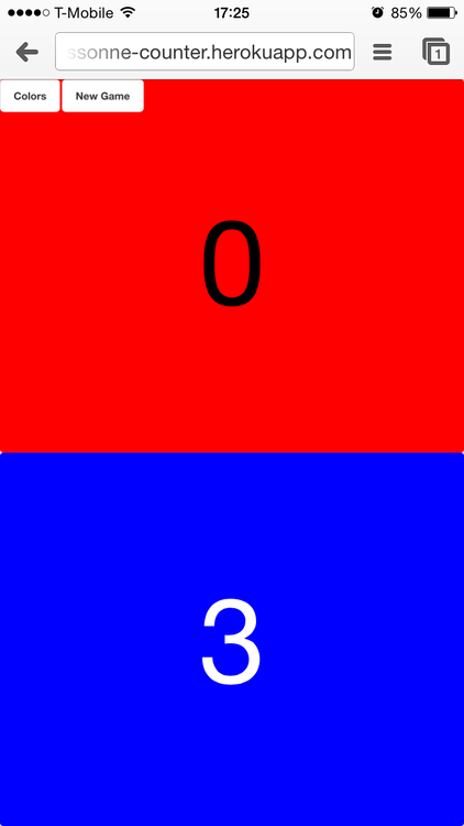
The entire page, no matter how many players were in the game (2-6), needed to be entirely fit for a mobile screen. For this I set the height and width to view width (vw) and view height (vh). CSS selectors, from body to each container for a players’ block, use vw/vh instead of pecentages or pixels. This means that no matter the size of the screen (an iPhone 6 vs a Nexus 7 vs a Moto X) the color block, given the HTML template, will fit the view’s width and height. This fixes the size of that HTML element to whatever “percentage” is selected. So for the above two player template, the CSS looks like this:
.container2 .player {

  width: 100vw;

  height: 50vh;

  line-height: 50vh;

}
This remains entirely responsive to whatever size screen / device the app is viewed on.
Clicking / Tapping Functionality
The main functionality of this app is clicking, or in the case of mobile use, tapping. One problem I encountered with the tapping functionality was that most mobile devices initialize double-tapping zoom as soon as tapping reaches a certain speed. On this single page, given that the view’s width and height is always fixed to the size of the screen, zooming isn’t necessary. I needed a way to disable that double-tap feature to allow for rapid tallying.
First step is including in the <head> a meta property that disables the user’s ability to change the view of the screen. This prevents the double-tapping zoom:
<meta name="viewport" content="user-scalable=no" />
Next, in order to utilize that double-tap functionality for rapid tapping, I used a super simple and easy JavaScript plugin called jQuery Finger.
In addition to setting an event handler on tap…
$(".player" + this.number).on("tap", function() {

  this.incrementNumber(); }.bind(this));
…you can also set one on double tap, using jQuery Finger’s custom event handler:
$(".player" + this.number).on("doubletap", function() {

  this.incrementNumber(); }.bind(this));
Focused Swiping Functionality
What if a player accidentally increments their tally, and they need to subtract some points? Swiping backwards on the number area where you’re tapping to increment is a logical gesture. jQuery Finger has an event handler for that as well:
$(".player" + this.number).on("flick", function() {

  this.decrementNumber(); }.bind(this));
Rack
Finally, I turned the single page application into a Rack app. This was entirely out of laziness, because I wanted to be able to host it easily, and Heroku is great for that. There are pluses and minuses to static Rack websites, and I won’t go too much into that only to say I think it’s fine for small, single page, side projects like this. I mostly followed this helpful guide on Heroku on how to set up a config.ru file.
Conclusion
Eventually I would love for Carcassonne Counter to be turned into something that’s in the App Store/Google Play Store, but ultimately this solution makes the most sense given the simple problem and the usage. The app is completely responsive for any sized screen, which makes it pretty versatile for users, and has many of the same mobile gesture capabilites as an iOS/Android app. Ultimately I’ll be building a Rails back end to persist game data and support other game counting/scoring as well, and at that point, this app will most likely be expanded on substantially, and perhaps I’ll even delve into making at iOS/Android then.
Written byFLATIRON SCHOOL
Make yourself useful.